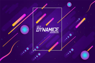
Modern Background with Dynamic Shape
A Modern Background with Dynamic Shape isn’t just another visual trend—it’s a functional design element that responds, adapts, and enhances how content is perceived. Think of it as a background that breathes: shifting subtly with scroll, resizing intelligently across devices, or animating in sync with user interaction. It’s used widely—from landing pages and presentation decks to digital portfolios and educational dashboards—because it adds depth, focus, and polish without overwhelming the message.
What People Often Misunderstand (and Why It Matters)
Many assume “dynamic” means “flashy.” That leads to choosing backgrounds with excessive motion, unpredictable transitions, or shapes that compete with text instead of supporting it. The result? Lower readability, higher bounce rates, and frustrated users—especially on mobile or slower connections. A background shouldn’t demand attention; it should quietly elevate clarity and intent.
Another common misstep is treating dynamic shape backgrounds as plug-and-play assets. Unlike static PNGs or SVGs, these often rely on CSS transforms, JavaScript libraries, or WebGL rendering. Without understanding the underlying tech, creators may drop a “modern” background into a site only to find it breaks layout flow, slows load time, or fails entirely on older browsers—or worse, degrades accessibility by obscuring contrast or interfering with screen readers.
1. Performance Isn’t Optional—It’s Foundational
A beautifully animated background built with heavy canvas libraries or unoptimized SVG paths can add 2–4 seconds to page load time. That’s enough to lose up to 53% of mobile visitors, per Google research. Before downloading or embedding, check: Does it use hardware-accelerated CSS properties (like transform and opacity) instead of layout-triggering ones (like width or top)? Is the animation will-change-optimized or wrapped in requestAnimationFrame? If you’re not sure, test it using Lighthouse or WebPageTest—not just on desktop, but on mid-tier Android devices too.
2. Responsiveness Goes Beyond “It Shrinks”
True responsiveness for dynamic shapes means more than scaling down. It means rethinking shape density on small screens—fewer overlapping curves, simplified paths, or even graceful fallbacks to subtle gradients or static variants. One freelance designer learned this the hard way when her client’s hero section looked elegant on desktop but turned into a chaotic blur on iPhone SE. The fix wasn’t more code—it was a media query that swapped the full dynamic SVG for a lightweight, CSS-only wave at max-width: 480px.
3. Accessibility Must Be Baked In—Not Added Later
Dynamic backgrounds often introduce motion, contrast shifts, or parallax effects that unintentionally trigger vestibular disorders or reduce legibility. A Modern Background with Dynamic Shape should allow users to reduce motion (via @media (prefers-reduced-motion)) and maintain at least 4.5:1 text-to-background contrast—even during transitions. Don’t assume your chosen asset does this. Test with real text overlays, toggle reduced-motion mode in browser dev tools, and verify color contrast using tools like axe or Stark.
How to Choose—and Use—More Thoughtfully
Start by clarifying your goal. Are you guiding attention toward a CTA? Creating emotional tone for a brand story? Supporting data visualization? Each purpose calls for different behavior: a gentle morphing gradient for calm trust, a rhythmic pulse for urgency, or a minimal geometric shift for clean professionalism. Avoid defaulting to what looks “cool” in a preview thumbnail.
When evaluating options—whether from marketplaces like Envato Elements, open-source repos, or custom-built tools—ask:
- Is the source code well-documented? Look for clear comments, usage examples, and notes about browser support—not just “works in Chrome.”
- Does it offer customization without breaking performance? Can you adjust speed, easing, or shape complexity via CSS variables or simple config—not by editing raw JS?
- Are fallbacks included or clearly explained? What happens if JavaScript fails? If the user has
prefers-reduced-motionenabled? If the device doesn’t supportclip-path?
For creators building their own: prioritize declarative over imperative approaches where possible. A CSS-only animated wave using mask-image and @keyframes will outperform a JavaScript-driven canvas render in most cases—and be far easier to audit, tweak, and maintain.
Real-World Fixes That Make a Difference
A small business owner launched a new service page with an eye-catching animated blob background—only to discover conversions dropped 18% after launch. Analytics showed high exit rates on the first scroll. The issue? The shape expanded aggressively on scroll, pushing key content below the fold before users could read the headline. The fix: limiting the animation’s vertical range and anchoring the main message in a fixed-position container. Conversions rebounded within 48 hours.
Similarly, an educator creating an online course landing page chose a vibrant, multi-layered dynamic background—then received feedback that students with dyslexia struggled to track text lines. She replaced the layered SVG with a single, softly pulsing shape behind the headline only—and added a toggle to disable motion entirely. Engagement metrics improved, and support requests dropped by 70%.
Before You Implement: A Quick Checklist
- Run a performance audit—especially Core Web Vitals (LCP, CLS, INP).
- Preview on at least three device sizes, including one low-end mobile.
- Verify text remains readable under all animation states—not just paused.
- Test with keyboard navigation and a screen reader to ensure no interference.
- Confirm licensing allows your intended use (e.g., commercial SaaS dashboard vs. personal blog).
A Modern Background with Dynamic Shape earns its place not by being novel, but by serving purpose with precision. It’s not about adding motion for motion’s sake—it’s about using shape, rhythm, and space to make communication clearer, experiences smoother, and interfaces more human. When chosen with intention—and tested with empathy—it becomes less of a decoration and more of a thoughtful design partner.